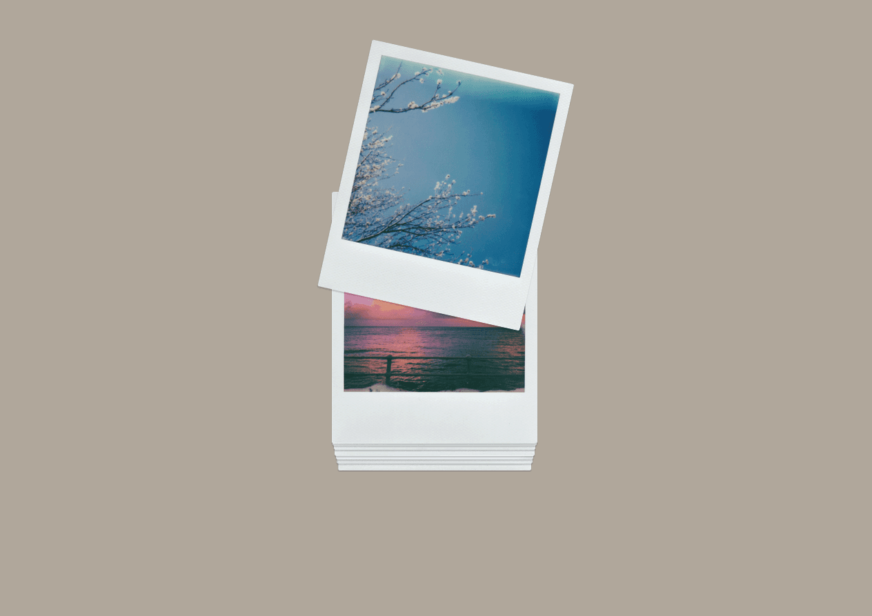
How to use
Use the button above to copy the component to the clipboard.
Paste it into your own project.
To start, set it to Width: Fill. Leave the height on Fit and it will take care of itself.
Connect your content:
Either upload your images individually
OR
You can connect a Gallery field from the CMS
Drag it onto the canvas. Set the outer wrapper width and height to fit, and make it a Stack (rather than a Grid). Set the inner items to have height: fit as well.
Back in the component now, set the Content dropdown to Canvas Element
Use the select field or the component connector to attach your Gallery field.
If all is well, you should see a Blue validation message confirming that images have been found. This message will only appear in the backend and not in preview or live.
Ensure that if you put your component inside of another stack that it has overflow set to visible. This keeps the stack context working properly.
Considerations
You can connect this component to CMS Collection Lists. This has been allowed intentionally, but it's up to you to use this feature appropriately and ensure that it styles and works reliably for your needs. I will not provide any support for this kind of usage.
Animations should be nice and smooth, but if you notice a drop in performance, try reviewing the resolution of your images. Do they need to be so large? Could you optimize them or choose a smaller resolution?